- It's possible that the `user_redirect` table contains a user id that
no longer exists.
- Delete a user redirect upon deleting the user.
- Add a check for these dangling user redirects to check-db-consistency.
- Fix placement of avatar image, this was not placed in the
`comment-header-left` and add CSS to cover the limiting of width+height
of avatar for code-review comment on "Files changed" page. This fixes
the big noticeable avatar issue.
- Apply `margin-bottom` to the "next" button, so it's consistent with
the "previous" button.
- Make sure the "next"/"previous" start at `flex-start` on mobile and
not off-screen at `flex-end`. As well force them to have `flex: 1` so
they won't overflow on x-asis. This also requires the `width: 100%` for
the `.ui.buttons` div.
- Resolves#20074
### Before
<details><img width="512"
src="https://user-images.githubusercontent.com/25481501/195952930-09560cad-419f-43a3-a8a4-a4166c117994.jpg"></details>
### After
<details><img width="512"
src="https://user-images.githubusercontent.com/25481501/197340081-0365dfa8-4344-46b4-8702-a40c778c073f.jpg"></details>
Co-authored-by: Lunny Xiao <xiaolunwen@gmail.com>
Co-authored-by: silverwind <me@silverwind.io>
- Currently `repository.Num{Issues,Pulls}` weren't checked and could
become out-of-consistency. Adds these two checks to `CheckRepoStats`.
- Fix incorrect SQL query for `repository.NumClosedPulls`, the check
should be for `repo_num_pulls`.
- Reference: https://codeberg.org/Codeberg/Community/issues/696
Adds a new option to only show relevant repo's on the explore page, for bigger Gitea instances like Codeberg this is a nice option to enable to make the explore page more populated with unique and "high" quality repo's. A note is shown that the results are filtered and have the possibility to see the unfiltered results.

Co-authored-by: vednoc <vednoc@protonmail.com>
Co-authored-by: delvh <dev.lh@web.de>
Co-authored-by: 6543 <6543@obermui.de>
- Currently the function takes in the `UserID` option, but isn't being
used within the SQL query. This patch fixes that by checking that only
teams are being returned that the user belongs to.
Fix#20829
Co-authored-by: delvh <dev.lh@web.de>
- Since
https://github.com/go-gitea/gitea/commit/b9e8fa5beb300eac7bd0623c9d7201a9e3a92a4a
the avatar will be inlined into the comment header, so there's more room
for the actual comment container(thus more text per line in the comment
body). However this didn't take into consideration that the flex didn't
allow any wrapping and thus was shrinking the avatar. Well this isn't a
perfect solution, as you ideally all want these elements to be
individually wrapped(such that `comment-header-right` can be on the same
line as `comment-header-left`, which now causes a new line in certain
situations). It's a better solution than the current CSS and to not
mess with the desktop CSS/HTML.

Co-authored-by: Lauris BH <lauris@nix.lv>
Co-authored-by: zeripath <art27@cantab.net>
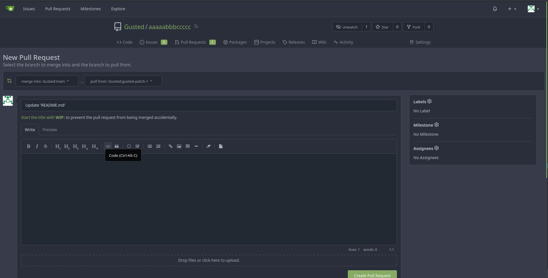
* Make branch icon stand out more

- Currently the branch icon is "squashed" between the two branch names
and feels a bit "amateur-ish" to my feeling(relative to other UI
elements).
- This patch tries to improve that by making the icon bigger
and by adding some margin to not have a "squashed" icon.
- This patch also includes a "fix", for some reason this symbol is not
centering correctly within the span(or without for that matter), so
simply manually patch this by adding `bottom: 1.px`.

* Use svg

* Apply suggestion

Co-authored-by: silverwind <me@silverwind.io>

Co-authored-by: silverwind <me@silverwind.io>
Co-authored-by: Lunny Xiao <xiaolunwen@gmail.com>
Co-authored-by: techknowlogick <techknowlogick@gitea.io>
- Git only decides to use the Wire 2 protocol when `git
{receive,upload}-pack` receive the `GIT_PROTOCOL` environment with as
value `version=2`. Currently the internal SSH Server wasn't passing this
environment through. The `gitea serv` code already passed all received
environments to the git command, so no code changes there.
* Add latest commit's SHA to content response
- When requesting the contents of a filepath, add the latest commit's
SHA to the requested file.
- Resolves#12840
* Add swagger
* Fix NPE
* Fix tests
* Hook into LastCommitCache
* Move AddLastCommitCache to a common nogogit and gogit file
Signed-off-by: Andrew Thornton <art27@cantab.net>
* Prevent NPE
Co-authored-by: Andrew Thornton <art27@cantab.net>
Co-authored-by: wxiaoguang <wxiaoguang@gmail.com>
- This is a regression of improving mobile experience on Gitea, currently organization dashboard aren't readable and the popup won't show up when you want to switch between users/organization(as we saw in #19978).
- This patch fixes that, by allowing the popup to allocate the required pixels(for some absurd reason, z-index doesn't work on the popup, so it's not able to render over the existing elements, we can investigate later of why this is). And also remove the additional dropdown menu for the pages link, so it's one unified list which then can be displayed as rows.
- When a repository has a pull request template, it will always override
the current content. With this PR it will prepend content to the
template content when appropriate. This is similar how GitHub(and GitLab
I presume) does it and it saves developers time to not go open their
commit and copy paste their will written commit message.
When you create a new release(e.g. via Tea) and specify a tag that already exists on
the repository, Gitea will instead use the `UpdateRelease`
functionality. However it currently doesn't set the Target field. This
PR fixes that.
* Use default values when provided values are empty
- When provided values are empty like `:3000` would imply that host is
empty, use the default value.
- Resolves#20316
* Update database.go
Co-authored-by: Lunny Xiao <xiaolunwen@gmail.com>
Co-authored-by: wxiaoguang <wxiaoguang@gmail.com>
- Currently when a Team has read access to a organization's non-private
repository, their access won't be stored in the database. This caused
issue for code that rely on read access being stored. So from now-on if
we see that the repository is owned by a organization don't increase the
minMode to write permission.
- Resolves#20083
- Currently the avatar in the navbar is being vertically aligned to the
top, this caused that the icon besides it isn't being at the middle of
the avatar. Use the `vm` helper class to force the `vertical-align` to
be `middle`.
- Resolves#20292
* Use dedicated draft PR icon when possible
- Currently the generic pull-request icon is used for draft PR's. This
patch changes that by using the dedicated icon for this.
- Resolves#20296
* Use draft title
- This code is only valid when `refNumeric` exist(otherwise we didn't find
such numeric PR and can skip that check) and give a free-pas to the "BEFORE" check when
`ref` is nil.
- Resolves#20109
- Given we use go1.18 for this and don't rely on the Go 1.11 modules
behavior(we use the modern `go run` & `go get` which has the correct
behavior by-default).
* Add username check to doctor

- Add a new breaking change detector to Gitea's doctor, which checks if
all users still have a valid username according to Gitea. Given from
time-to-time we need to make changes, either due to new routes or due to
security, it's for a instance's admin to check if all users still have a
valid username.

* Fix extra argument

* Apply suggestions from code review

Co-authored-by: Jimmy Praet <jimmy.praet@telenet.be>

* Apply suggestions from code review

Co-authored-by: delvh <dev.lh@web.de>

Co-authored-by: Jimmy Praet <jimmy.praet@telenet.be>
Co-authored-by: John Olheiser <john.olheiser@gmail.com>
Co-authored-by: techknowlogick <matti@mdranta.net>
Co-authored-by: delvh <dev.lh@web.de>
* Refactor `i18n` to `locale`

- Currently we're using the `i18n` variable naming for the `locale`
struct. This contains locale's specific information and cannot be used
for general i18n purpose, therefore refactoring it to `locale` makes
more sense.
- Ref: https://github.com/go-gitea/gitea/pull/20096#discussion_r906699200

* Update routers/install/install.go
- Firefox on Windows will unconditionally show scrollbars when you
specify `overflow: scroll`. This is bad behavior, as you don't always
need the scrollbar. Changing the scroll value to auto fixes this issue
and only shows the scrollbar when necessary.
- Resolves#20139
Co-authored-by: Lunny Xiao <xiaolunwen@gmail.com>
- Completely remove U2F support from 1.18.0, 1.17.0 will be the last
release that U2F is somewhat supported. Users who used U2F would already
be warned about using U2F for a while now and should hopefully already
be migrated. But starting 1.18 definitely remove it.
* Prototyping

* Start work on creating offsets

* Modify tests

* Start prototyping with actual MPH

* Twiddle around

* Twiddle around comments

* Convert templates

* Fix external languages

* Fix latest translation

* Fix some test

* Tidy up code

* Use simple map

* go mod tidy

* Move back to data structure

- Uses less memory by creating for each language a map.

* Apply suggestions from code review

Co-authored-by: delvh <dev.lh@web.de>

* Add some comments

* Fix tests

* Try to fix tests

* Use en-US as defacto fallback

* Use correct slices

* refactor (#4)

* Remove TryTr, add log for missing translation key

* Refactor i18n

- Separate dev and production locale stores.
- Allow for live-reloading in dev mode.

Co-authored-by: zeripath <art27@cantab.net>

* Fix live-reloading & check for errors

* Make linter happy

* live-reload with periodic check (#5)

* Fix tests

Co-authored-by: delvh <dev.lh@web.de>
Co-authored-by: 6543 <6543@obermui.de>
Co-authored-by: wxiaoguang <wxiaoguang@gmail.com>
Co-authored-by: zeripath <art27@cantab.net>
Store the file uuid(which is returned by Gitea in the upload file
response) onto the file object, so it can be used for the remove feature
to specify this file.
Fix#20115
- Fomantic tries to prevent overflowing on the `y/x`-as by default on
stackable menu's on mobile screens. We already solve this issue by
forcing overflow on x as and hide it on y as(due to some issues with
other menu's), since https://github.com/go-gitea/gitea/pull/19486.
- However this edge case does require a y-overflow to show the dropdown,
because you cannot easily adjust this with CSS, once you're fiddling
with overflow's (https://stackoverflow.com/a/6433475). However
interesting behavior is noted
https://css-tricks.com/popping-hidden-overflow/ when you remove the
position: relative, it will suddenly work again. Well because this is
the only solution without redesigning dropdowns, I think we can live
with the side-effect of the dropdown items being full-width instead
"relative" width to their parent.
- Resolves#19976
Co-authored-by: Lunny Xiao <xiaolunwen@gmail.com>
- We don't need to buffer the logger with a thousand capacity. It's not
a high-throughput logger, this also caused issue whereby the logger
can't keep up with repeated messages being send(somehow they are lost in
the queue?).
- Resolves#19969
Co-authored-by: Lunny Xiao <xiaolunwen@gmail.com>
- Don't specify the field in `Count` instead use `Cols` for this.
- Call `log.Error` when a error occur.

Co-authored-by: Lunny Xiao <xiaolunwen@gmail.com>
- Always give a best-effort to fetching the repositories, if even that
fails indeed give a disconnected mirror found error.
- *Partially* resolves#19928
Co-authored-by: wxiaoguang <wxiaoguang@gmail.com>
* Prettify number of issues

- Use the PrettyNumber function to add commas in large amount of issues.

* Use client-side formatting

* prettify on both server and client

* remove unused i18n entries

* handle more cases, support other int types in PrettyNumber

* specify locale to avoid issues with node default locale

* remove superfluos argument

* introduce template helper, octicon tweaks, js refactor

* Update modules/templates/helper.go

* Apply some suggestions.

* Add comment

* Update templates/user/dashboard/issues.tmpl

Co-authored-by: silverwind <me@silverwind.io>

Co-authored-by: silverwind <me@silverwind.io>
Co-authored-by: Lunny Xiao <xiaolunwen@gmail.com>
- File headers can become quite width, so ensure the file size is not
being wrapped into itself(width + padding-right) and allow the overflow
to be scrolled(overflow-x).
* Add breaking change check in doctor

- This patch introduces a new kind of doctor type, breaking. This file
is made to register checks that helps with detecting when a breaking
change might impact a Gitea instance.
- For now the only check here(and the reason of creating this) is to
check if all users in the database has a valid email address, which
might not be the case after
https://github.com/go-gitea/gitea/pull/17688. This _simply_ uses the
validation function to detect and report these cases.
- Helps admins with detecting #19897.
- I have no clue which priority should be and IsDefault is true, because
when breaking change happen and we have a doctor check for it, we can
say "run `gitea doctor` to help you with this and maybe you find other
errors 😉".

* Makes no sense tbh

* Fix copyright

* Update modules/doctor/breaking.go

Co-authored-by: Lunny Xiao <xiaolunwen@gmail.com>

Co-authored-by: techknowlogick <matti@mdranta.net>
Co-authored-by: Lunny Xiao <xiaolunwen@gmail.com>
Co-authored-by: techknowlogick <techknowlogick@gitea.io>
- To use the web's API to get information about a issue/pull on a
repository, doesn't require authorization(nor that the repository isn't
archived).
- Regressed by: #19318


Signed-off-by: Andrew Thornton <art27@cantab.net>
Co-authored-by: Andrew Thornton <art27@cantab.net>
* Fix inconsistency in doctor output

- Use `logger.Info` instead of `logger.Warn` when no errors were found.

* Update modules/doctor/fix16961.go

Co-authored-by: delvh <dev.lh@web.de>

Co-authored-by: Lunny Xiao <xiaolunwen@gmail.com>
Co-authored-by: delvh <dev.lh@web.de>
Co-authored-by: techknowlogick <techknowlogick@gitea.io>
- This is a continuation on [the work](https://github.com/go-gitea/gitea/pull/19546) I've done for improving mobile experience on Gitea.
- The current behavior of going trough the commits list is horrible, each individual item gets it's own row and thereby isn't quite compact as it should be on mobile. The commit view's header is in a bit better state, it's quite only that content is overlapping each other.
- This patch fixes those problems. Each row in the commit list table will actually take a row in the UI. The commit view's header has now a better organized way of placing the information.
- Don't use hacky solution to limit to the correct RepoID's, instead use
current code to handle these limits. The existing code is more correct
than the hacky solution.
- Resolves#19636
- Add test-case
* Use a better OlderThan for DeleteInactiveUsers

- Currently the OlderThan is zero, for instances that enable or run this
task this could actually delete just new users that still need to
confirm their email. This patch fixes that by setting the default to the
`ActiveCodeLives` setting, which corresponds to the amount of time that
a user can active their account, thus avoiding the issue of deleting
unactivated email users.

* Use correct duration
- Don't log the reflect struct, but instead log the ID of the struct.
This improves the error message, as you would actually know which row is
the error.
* Only check for non-finished migrating task
- Only check if a non-finished migrating task exists for a mirror before
fetching the mirror details from the database.
- Resolves#19600
- Regression: #19588
* Clarify function
- When a repository is still being migrated, don't try to fetch the
Mirror from the database. Instead skip it. This allows to visit
repositories that are still being migrated and were configured to be
mirrored.
- Resolves#19585
- Regression: #19295
Co-authored-by: wxiaoguang <wxiaoguang@gmail.com>
Start making the mobile experience not painful and be actually usable. This contains a few smaller changes to enhance this experience.

- Submit buttons on the review forms aren't columns anymore and are now allowed to be displayed on one row.
- The label/milestone & New Issue buttons were given each own row even tough, there's enough place to do it one the same row. This commit fixes that.
- The issues+Pull tab on repo's has a third item besides the label/milestone & New Issue buttons, the search bar. On desktop there's enough place to do this on one row, for mobile it isn't, currently it was using for each item a new row. This commits fixes that by only giving the searchbar a new row and have the other two buttons on the same row.
- The notification table will now be show a scrollbar instead of overflow.
- The repo buttons(Watch, Star, Fork) on mobile were showing quite big and the SVG wasn't even displayed on the same line, if the count of those numbers were too high it would even overflow. This commit removes the SVG, as there isn't any place to show them on the same row and allows them to have a new row if the counts of those buttons are high.
- The admin page can show you a lot of interesting information, on mobile the System Status + Configuration weren't properly displayed as the margin's were too high. This commit fixes that by reducing the margin to a number that makes sense on mobile.
- Fixes to not overflow the tables but instead force them to be scrollable.
- When viewing a issue or pull request, the comments aren't full-width but instead 80% and aligned to right, on mobile this is a annoyance as there isn't much width to begin with. This commits fixes that by forcing full-width and removing the avatars on the left side and instead including them inline in the comment header.
* Don't error when branch's commit doesn't exist
- If one of the branches no longer exists, don't throw an error, it's possible that the branch was destroyed during the process. Simply skip it and disregard it.
- Resolves#19541
* Don't send empty objects
* Use more minimal approach
* Make repository file list useable on mobile

- When you're browsing a repository on mobile, you're met by a giant
block called the "repository file list". The current design is not
useable for mobile and is a big annoyance while browsing a repo on
mobile. This PR removes that annoyance by making it more suitable design
when on mobile.
- Adds HTML for the commit/file time to align it vertically(noticeable
on mobile, not on PC).
- Show all information horizontally and not vertically.
- Remove the last commit message of the file, there isn't enough space
on mobile to place this anywhere, so we're not trying to make a
best-effort here and instead just not display it.

* Remove unnecessary `!important`

* Fix broken HTML

* Simplify code
- Doing 64-bit atomic operations on 32-bit machines is a bit tricky by
golang, as they can only be done under certain set of
conditions(https://pkg.go.dev/sync/atomic#pkg-note-BUG).
- This PR fixes such case whereby the conditions weren't met, it moves
the int64 to the first field of the struct, which will 64-bit operations
happening on this property on 32-bit machines.
- Resolves#19518
- Apparently `<input>` elements differ from other elements have a size
attribute that act as a `min-width` CSS property, this causes a overflow
on mobile. By setting this size to `1` it doesn't try to force a
min-width and nicely shrink down.
* Improve dashboard's repo list performance

- Avoid a lot of database lookups for all the repo's, by adding a
undocumented "minimal" mode for this specific task, which returns the
data that's only needed by this list which doesn't require any database
lookups.
- Makes fetching these list faster.
- Less CPU overhead when a user visits home page.

* Refactor javascript code + fix Fork icon

- Use async in the function so we can use `await`.
- Remove `archivedFilter` check for count, as it doesn't make sense to
  show the count of repos when you can't even see them(as they are
  filited away).

* Add `count_only`

* Remove uncessary code

* Improve comment

Co-authored-by: delvh <dev.lh@web.de>

* Update web_src/js/components/DashboardRepoList.js

Co-authored-by: delvh <dev.lh@web.de>

* Update web_src/js/components/DashboardRepoList.js

Co-authored-by: delvh <dev.lh@web.de>

* By default apply minimal mode

* Remove `minimal` paramater

* Refactor count header

* Simplify init

Co-authored-by: wxiaoguang <wxiaoguang@gmail.com>

Co-authored-by: delvh <dev.lh@web.de>
Co-authored-by: wxiaoguang <wxiaoguang@gmail.com>
Co-authored-by: zeripath <art27@cantab.net>
* By default force vertical tabs on mobile

- While experimenting with using vertical tabs instead of horizontal
tabs on gitea for a better mobile experience, I made a recent
PR(https://github.com/go-gitea/gitea/pull/19468) in order to see if
there was any objections to this new behavior for the repo headers(one
of the most annoying horizontal tabs). This PR had no objections and
even a user commenting that this change is brilliant.
- This PR now improves upon the previous PR by making this the de-facto
behavior for all menu's on mobile. The only exemption is the navbar
which also uses the menu but caught some layout errors with the changes.

* Fix organisation

* Fix repo/wiki buttons

Co-authored-by: Lunny Xiao <xiaolunwen@gmail.com>
* Use horizontal tabs for repo header on mobile

- The current behavior of the repo header on mobile is to display them
vertically column-by-column. I've only experience annoyance due to this
while trying to visit gitea instanced on mobile. This commit changes
this behavior to use horizontal tabs, it uses less tabs and doesn't
bloat 60% of your mobile screen with the repo headers.
- A small fix added in this commit is to give some space around the repo
buttons, current behavior is that they are too "close" to the repo
title.

* Fix lint
* Set correct PR status on 3way on conflict checking

- When 3-way merge is enabled for conflict checking, it has a new
interesting behavior that it doesn't return any error when it found a
conflict, so we change the condition to not check for the error, but
instead check if conflictedfiles is populated, this fixes a issue
whereby PR status wasn't correctly on conflicted PR's.
- Refactor the mergeable property(which was incorrectly set and lead me this
bug) to be more maintainable.
- Add a dedicated test for conflicting checking, so it should prevent
future issues with this.

* Fix linter
 Gusted