Hester Gong and wxiaoguang
f1a4330306
Modify width of ui container, fine tune css for settings pages and org header ( #24315 )
...
Close #24302
Part of #24229 , Follows #24246
This PR focused on CSS style fine-tune, main changes:
1. Give `.ui.ui.ui.container` a width of `1280px` with a max-width of
`calc(100vw - 64px)`, so the main contents looks better on large
devices.
2. Share styles for table elements in all levels settings pages to fix
overflow of runners table on mobile and for consistency (The headers on
mobile can be further improved, but haven't found a proper way yet).
3. Use [stackable
grid](https://fomantic-ui.com/collections/grid.html#stackable ) and
[device column width](https://fomantic-ui.com/examples/responsive.html )
for responsiveness for some pages (repo/org collaborators settings
pages, org teams related page)
4. Fixed #24302 by sharing label related CSS in reporg.css
5. Fine tune repo tags settings page
---------
Co-authored-by: wxiaoguang <wxiaoguang@gmail.com >
2023-04-26 11:59:08 -04:00
Hester Gong and wxiaoguang
44e0cfa96e
Change to vertical navbar layout for secondary navbar for repo/user/admin settings ( #24246 )
...
Co-Author: @wxiaoguang
This is the first step of #24229 . And this PR will only includes html
changes, and followed by other PRs that fine tune css and change to
submenus.
After:
Admin Level
<img width="1400" alt="Screen Shot 2023-04-21 at 10 07 16"
src="https://user-images.githubusercontent.com/17645053/233523870-f848b61d-056a-4b41-9760-a9a49fea1fe8.png ">
User Level
<img width="1422" alt="Screen Shot 2023-04-21 at 10 07 23"
src="https://user-images.githubusercontent.com/17645053/233523878-979adb20-a657-43d9-99a6-ad414010c0ef.png ">
Repo Level
<img width="1404" alt="Screen Shot 2023-04-21 at 10 07 07"
src="https://user-images.githubusercontent.com/17645053/233523863-337440bd-c03a-4dfd-87fa-cef40300bfe0.png ">
---------
Co-authored-by: wxiaoguang <wxiaoguang@gmail.com >
2023-04-23 18:21:21 +08:00
Hester Gong and wxiaoguang
476a043a5f
Refactor delete_modal_actions template and use it for project column related actions ( #24097 )
...
Co-Author: @wxiaoguang
This PR is to fix
https://github.com/go-gitea/gitea/issues/23318#issuecomment-1506275446 .
The way to fix this in this PR is to use `delete_modal_actions.tmpl`
here both to fix this issue and keep ui consistency (as suggested by
[TODO
here](https://github.com/go-gitea/gitea/blob/4299c3b7db61f8741eca0ba3d663bb65745a4acc/templates/projects/view.tmpl#L161 ))
And this PR also refactors `delete_modal_actions.tmpl` and its related
styles, and use the template for more modal actions:
1. Added template attributes:
* locale
* ModalButtonStyle: "yes" (default) or "confirm"
* ModalButtonCancelText
* ModalButtonOkText
2. Rename `delete_modal_actions.tmpl` template to
`modal_actions_confirm.tmpl` because it is not only used for action
modals deletion now.
3. Refactored css related to modals into `web_src/css/modules/modal.css`
and improved the styles.
4. Also use the template for PR deletion modal and remove issue
dependency modal.
5. Some modals should also use the template, but not sure how to open
them, so mark these modal actions by `{{/* TODO: Convert to
base/modal_actions_confirm */}}`
After (Also tested on arc green):
Hovering on the left buttons
<img width="711" alt="Screen Shot 2023-04-23 at 15 17 12"
src="https://user-images.githubusercontent.com/17645053/233825650-76307e65-9255-44bb-80e8-7062f58ead1b.png ">
<img width="786" alt="Screen Shot 2023-04-23 at 15 17 21"
src="https://user-images.githubusercontent.com/17645053/233825652-4dc6f7d1-a180-49fb-a468-d60950eaee0d.png ">
Test for functionalities:
https://user-images.githubusercontent.com/17645053/233826857-76376fda-022c-42d0-b0f3-339c17ca4e59.mov
---------
Co-authored-by: wxiaoguang <wxiaoguang@gmail.com >
2023-04-23 17:24:19 +08:00
Hester Gong and Giteabot
6793ef0069
Use secondary pointing menu for tabs on user/organization home page ( #24162 )
...
Close #24108
Use secondary pointing menu for tabs on user/organization home page so
the tabs look the same.
Main changes:
1. modified a part of dom structure in
`templates/user/overview/header.tmpl` to make it the same as
`templates/org/header.tmpl` in order to produce the same ui.
2. Move some css to `web_src/css/shared/repoorgshared.css` to make them
shareable between `templates/user/overview/header.tmpl` and
`templates/org/header.tmpl`
After:
https://user-images.githubusercontent.com/17645053/232400617-2add5bec-d483-4ab1-b48d-eaee157f7b09.mov
For further improvements. Need some thoughts:
For [this
TODO](https://github.com/HesterG/gitea/blob/729ad294cbec7a77623b2e3eab750ea7a20e8ee0/templates/user/overview/header.tmpl#L1 ),
it is viable to make it a shared template for [this
part](https://github.com/HesterG/gitea/blob/729ad294cbec7a77623b2e3eab750ea7a20e8ee0/templates/user/overview/header.tmpl#L2-L17 )
and [this
part](https://github.com/HesterG/gitea/blob/729ad294cbec7a77623b2e3eab750ea7a20e8ee0/templates/org/header.tmpl#L1-L16 )
because they are the same except for the variable. But for the menu
parts, they are quite different so might not be suitable to use a shared
template. So need some thoughts and advice about extracting the shared
template from these two headers.
---------
Co-authored-by: Giteabot <teabot@gitea.io >
2023-04-20 04:58:26 -04:00
Hester Gong and Jason Song
5e7543fcf4
Use same action status svg icons on actions list as on action page ( #24178 )
...
Close #24020
After:
These icons are the same now:
<img width="1287" alt="截屏2023-04-18 13 52 11"
src="https://user-images.githubusercontent.com/17645053/232684252-05ddc101-dc5b-41b5-b374-132c3d853a41.png ">
<img width="1141" alt="截屏2023-04-18 13 54 48"
src="https://user-images.githubusercontent.com/17645053/232684261-6ebd864a-a9aa-4982-af32-2cea91c35be8.png ">
In this PR, didn't use `ActionRunStatus.vue` because the mounting of the
component will cause flash of the icons like below:
https://user-images.githubusercontent.com/17645053/232682646-713202dc-9023-4b9c-a849-c3a1ae6dd155.mov
Instead, modified and used `status.tmpl` to make it the same as
`ActionRunStatus.vue` to avoid the ui flash (Welcomed to show how to use
`ActionRunStatus.vue` without flashing if there is a way).
Added comments to both of them for reminding synchronization of these
two files.
---------
Co-authored-by: Jason Song <i@wolfogre.com >
2023-04-19 13:42:53 +08:00
Hester Gong
7ca7590c39
Fix duplicate modals when clicking on "remove all" repository button ( #24129 )
...
Under Team tab of an organization, click on "remove all" repositories
button will trigger two modals. Because `data-modal-id` is not proerly
added.

Before:

https://user-images.githubusercontent.com/17645053/231988545-ac690b86-e3fe-4bf5-81c6-5ef09302e849.mov

After:

https://user-images.githubusercontent.com/17645053/231989678-53be4f91-fdc9-4bc5-ba11-a08aa4548e37.mov
2023-04-19 00:49:49 +08:00
Hester Gong
6f3c162f48
Fix wrong scopes of locale.PrettyNumber ( #24181 )
2023-04-18 19:26:57 +08:00
b43ad51a3d
Add popup to hashed comments/pull requests/issues in file editing/adding preview tab ( #24040 )
...
#23734 didn't add popups(tippy) to ref issues for the preview tab when
adding/editing a file
The location of the preview tab:
<img width="1214" alt="截屏2023-04-10 13 55 38"
src="https://user-images.githubusercontent.com/17645053/230836213-a73f0cee-378c-4a21-93db-583ba2c72f77.png ">
This PR resues the logic in `ComboMarkdownEditor.js` to also add popup
to hashed comments/pull requests/issues in file editing/adding preview
tab.
After - On hover:
<img width="1222" alt="截屏2023-04-10 13 55 42"
src="https://user-images.githubusercontent.com/17645053/230836250-527ca7d0-6ec4-4c68-89ab-4f1b57b09239.png ">
---------
Co-authored-by: Lunny Xiao <xiaolunwen@gmail.com >
Co-authored-by: silverwind <me@silverwind.io >
2023-04-11 23:03:23 -04:00
Hester Gong and Giteabot
6a4be2cb6a
Add cardtype to org/user level project on creation, edit and view ( #24043 )
...
Part of #23318
The way to fix the missing cardtype for user/org level projects in this
PR is to port the cardtype related part from #22112 to org/user level
projects' template and router functions.
Before:
<img width="1135" alt="截屏2023-04-11 13 55 49"
src="https://user-images.githubusercontent.com/17645053/231069068-ba897129-ae90-4aa0-9b0f-468bf5c65375.png ">
<img width="1131" alt="截屏2023-04-11 13 55 59"
src="https://user-images.githubusercontent.com/17645053/231069084-279f6681-5a10-42da-b5a8-2b0ba47c7078.png ">
After:
Create
<img width="835" alt="截屏2023-04-11 13 27 16"
src="https://user-images.githubusercontent.com/17645053/231064445-0d6e12bd-5725-48db-a102-80e7472757c2.png ">
Edit
<img width="852" alt="截屏2023-04-11 13 27 05"
src="https://user-images.githubusercontent.com/17645053/231064503-c70525cd-1038-43ec-8d93-8b8d95d183d4.png ">
View
<img width="1329" alt="截屏2023-04-11 13 26 56"
src="https://user-images.githubusercontent.com/17645053/231064529-26023c85-698b-4b2e-af02-45f9820c77ec.png ">
Co-authored-by: Giteabot <teabot@gitea.io >
2023-04-11 14:28:40 -04:00
Hester Gong
f9d6092cfe
Remove "inverted" class on creating new label and cancel buttons ( #24030 )
...
"inverted" class might not be needed because background of these two
buttons is light color.
inverted related rule from `semantic.css`:
```css
.ui.inverted.green.basic.buttons .button,
.ui.inverted.green.buttons .basic.button,
.ui.inverted.green.basic.button {
background-color: transparent;
box-shadow: 0 0 0 2px rgba(255, 255, 255, 0.5) inset;
color: #FFFFFF;
}
```
Before:
<img width="771" alt="截屏2023-04-10 17 21 22"
src="https://user-images.githubusercontent.com/17645053/230873878-cc64b3d6-ffa9-4cae-9280-07b06f7829b2.png ">
After:
<img width="765" alt="截屏2023-04-10 17 22 14"
src="https://user-images.githubusercontent.com/17645053/230873956-9412054f-b739-4878-9ee9-57ff65eb7910.png ">
2023-04-10 20:00:30 +08:00
a519aac6d5
Show protected branch rule names again ( #23907 )
...
`!important`s for one of the primary label selectors are removed by
#23774 , so the repository branch protection settings ui will not have
the demanding css. This PR modifies `.ui.primary.label` to fix it.
Before:
<img width="1408" alt="飞书20230404-115410"
src="https://user-images.githubusercontent.com/17645053/229683221-ef9c7d5c-68a8-42b0-ba19-ef2d5dfce5f9.png ">
After:
<img width="1419" alt="截屏2023-04-04 11 56 32"
src="https://user-images.githubusercontent.com/17645053/229683469-70cfc92d-d7ef-4323-a7f5-2247810fabce.png ">
---------
Co-authored-by: delvh <dev.lh@web.de >
Co-authored-by: Lunny Xiao <xiaolunwen@gmail.com >
2023-04-09 06:15:43 -04:00
6eb678374b
Refactor authors dropdown (send get request from frontend to avoid long wait time) ( #23890 )
...
Right now the authors search dropdown might take a long time to load if
amount of authors is huge.
Example: (In the video below, there are about 10000 authors, and it
takes about 10 seconds to open the author dropdown)
https://user-images.githubusercontent.com/17645053/229422229-98aa9656-3439-4f8c-9f4e-83bd8e2a2557.mov
Possible improvements can be made, which will take 2 steps (Thanks to
@wolfogre for advice):
Step 1:
Backend: Add a new api, which returns a limit of 30 posters with matched
prefix.
Frontend: Change the search behavior from frontend search(fomantic
search) to backend search(when input is changed, send a request to get
authors matching the current search prefix)
Step 2:
Backend: Optimize the api in step 1 using indexer to support fuzzy
search.
This PR is implements the first step. The main changes:
1. Added api: `GET /{type:issues|pulls}/posters` , which return a limit
of 30 users with matched prefix (prefix sent as query). If
`DEFAULT_SHOW_FULL_NAME` in `custom/conf/app.ini` is set to true, will
also include fullnames fuzzy search.
2. Added a tooltip saying "Shows a maximum of 30 users" to the author
search dropdown
3. Change the search behavior from frontend search to backend search
After:
https://user-images.githubusercontent.com/17645053/229430960-f88fafd8-fd5d-4f84-9df2-2677539d5d08.mov
Fixes: https://github.com/go-gitea/gitea/issues/22586
---------
Co-authored-by: wxiaoguang <wxiaoguang@gmail.com >
Co-authored-by: silverwind <me@silverwind.io >
2023-04-07 08:11:02 +08:00
Hester Gong
ca905b82df
Append (comment) when a link points at a comment rather than the whole issue ( #23734 )
...
Close #23671
For the feature mentioned above, this PR append ' (comment)' to the
rendered html if it is a hashcomment.
After the PR, type in the following
```
pull request from other repo:
http://localhost:3000/testOrg/testOrgRepo/pulls/2
pull request from this repo:
http://localhost:3000/aaa/testA/pulls/2
issue comment from this repo:
http://localhost:3000/aaa/testA/issues/1#issuecomment-18
http://localhost:3000/aaa/testA/pulls/2#issue-9
issue comment from other repo:
http://localhost:3000/testOrg/testOrgRepo/pulls/2#issuecomment-24
http://localhost:3000/testOrg/testOrgRepo/pulls/2#issue
```
Gives:
<img width="687" alt="截屏2023-03-27 13 53 06"
src="https://user-images.githubusercontent.com/17645053/227852387-2b218e0d-3468-4d90-ad81-d702ddd17fd2.png ">
Other than the above feature, this PR also includes two other changes:
1 Right now, the render of links from file changed tab in pull request
might not be very proper, for example, if type in the following. (not
sure if this is an issue or design, if not an issue, I will revert the
changes). example on
[try.gitea.io](https://try.gitea.io/HesterG/testrepo/pulls/1 )
```
https://try.gitea.io/HesterG/testrepo/pulls/1/files#issuecomment-162725
https://try.gitea.io/HesterG/testrepo/pulls/1/files
```
it will render the following
<img width="899" alt="截屏2023-03-24 15 41 37"
src="https://user-images.githubusercontent.com/17645053/227456117-5eccedb7-9118-4540-929d-aee9a76de852.png ">
In this PR, skip processing the link into a ref issue if it is a link
from files changed tab in pull request
After:
type in following
```
hash comment on files changed tab:
http://localhost:3000/testOrg/testOrgRepo/pulls/2/files#issuecomment-24
files changed link:
http://localhost:3000/testOrg/testOrgRepo/pulls/2/files
```
Gives
<img width="708" alt="截屏2023-03-27 22 09 02"
src="https://user-images.githubusercontent.com/17645053/227964273-5dc06c50-3713-489c-b05d-d95367d0ab0f.png ">
2 Right now, after editing the comment area, there will not be tippys
attached to `ref-issue`; and no tippy attached on preview as well.
example:
https://user-images.githubusercontent.com/17645053/227850540-5ae34e2d-b1d7-4d0d-9726-7701bf825d1f.mov
In this PR, in frontend, make sure tippy is added after editing the
comment, and to the comment on preview tab
After:
https://user-images.githubusercontent.com/17645053/227853777-06f56b4c-1148-467c-b6f7-f79418e67504.mov
2023-04-03 16:02:57 +08:00
Hester Gong
7df036f1a5
Use different SVG for pending and running actions ( #23836 )
...
Before:
<img width="641" alt="截屏2023-03-31 11 12 17"
src="https://user-images.githubusercontent.com/17645053/229013472-237701db-2c30-4477-a7b5-d40640361b14.png ">
<img width="576" alt="截屏2023-03-31 11 10 48"
src="https://user-images.githubusercontent.com/17645053/229013535-571aa8be-8e58-4d93-8641-9b8b5fd90108.png ">
After:
<img width="709" alt="截屏2023-03-31 11 05 44"
src="https://user-images.githubusercontent.com/17645053/229012963-ccd1e9a7-8bea-4197-aa36-865eafbf8858.png ">
<img width="528" alt="截屏2023-03-31 11 06 56"
src="https://user-images.githubusercontent.com/17645053/229012971-a7313eb6-ecd2-4da3-89a7-c20be33f4611.png ">
2023-03-31 17:24:39 +08:00
Hester Gong and wxiaoguang
f401337f64
fix br display for packages curls ( #23737 )
...
Before:
<img width="1403" alt="截屏2023-03-27 15 48 23"
src="https://user-images.githubusercontent.com/17645053/227875392-399debf7-db75-4d9a-9436-409f75447c65.png ">
This happens because the `<br>` matches this
[rule](https://github.com/go-gitea/gitea/blob/e6e602fd8d35471f1e2f4a42669a1f17e76e0176/web_src/css/markup/content.css#L428 ),
which is not necessary here (This is introduced by #22861 , did a quick
check, and this is the only place used `<br>` inside `<code>` from the
PR):
```css
.markup code br,
.markup tt br {
display: none;
}
```
After:
<img width="1398" alt="截屏2023-03-27 15 46 50"
src="https://user-images.githubusercontent.com/17645053/227875244-b7fba432-b32c-42f7-9517-4e05bb2e64ea.png ">
---------
Co-authored-by: wxiaoguang <wxiaoguang@gmail.com >
2023-03-28 01:18:01 -04:00
Hester Gong and silverwind
ac64c82974
Allow new file and edit file preview if it has editable extension ( #23624 )
...
Close #23579
Inspired by
[idea](https://github.com/go-gitea/gitea/issues/23579#issuecomment-1475429247 )
from @brechtvl
In this PR, the behavior is when extension switches from writatble to
not, preview will hide, and vice versa.
demo:
https://user-images.githubusercontent.com/17645053/226786119-d20063da-8763-41ce-9b00-ae34929120e1.mov
---------
Co-authored-by: silverwind <me@silverwind.io >
2023-03-26 13:25:41 +08:00
Hester Gong
a9cceb0597
Fix long project name display in issue list and in related dropdown ( #23653 )
...
This PR is to fix the second problem mentioned in #23625 , along with the
long texts problem in `issue-item-bottom-row` of `issuelist.tmpl`
Main changes are:
1. Add `max-width` to the search dropdowns in issue list and make the
possible long texts inside to show ellipsis if texts are long
2. Adjust the conditions in
[issuelist.tmpl](https://github.com/go-gitea/gitea/blob/1d35fa0e784dffcadacb2322a3d7ac3ec2ff89b2/templates/shared/issuelist.tmpl#L146-L167 )
to fix the problem as mentioned by the
[comment](https://github.com/go-gitea/gitea/issues/23625#issuecomment-1479281060 )
3. Use `word-break: break-word;` in `issue-item-bottom-row` to break the
possible long texts.
After the PR
issuelist in repo (similar for pr list):
<img width="366" alt="截屏2023-03-23 17 42 40"
src="https://user-images.githubusercontent.com/17645053/227163953-93e9adbd-5785-4c16-b538-9db901787775.png ">
dropdowns with long name (Here take reference from github to deal with
the long names cases: show ellipsis with no title, because all these
options are clickable, and it might not be necessary to add titles to
them ):
<img width="370" alt="截屏2023-03-23 17 43 50"
src="https://user-images.githubusercontent.com/17645053/227164215-df6fcaaa-9fee-4256-a57c-053fbcffafbb.png ">
<img width="365" alt="截屏2023-03-23 17 43 56"
src="https://user-images.githubusercontent.com/17645053/227164227-9c99abcd-f410-4e07-b5b8-cbce764eedcd.png ">
issue page (similar for pr page):
<img width="374" alt="截屏2023-03-23 17 45 37"
src="https://user-images.githubusercontent.com/17645053/227164668-654a8188-dac8-4bbf-a6e3-f3768a644a1b.png ">
on PC:
<img width="1412" alt="截屏2023-03-23 17 47 20"
src="https://user-images.githubusercontent.com/17645053/227166694-e7bcc6e5-9667-4cef-9fbf-db85640a2c6c.png ">
<img width="1433" alt="截屏2023-03-23 17 46 40"
src="https://user-images.githubusercontent.com/17645053/227165182-4e2a5d19-74bc-4c66-b73c-23cbca176ffe.png ">
2023-03-24 15:11:23 +08:00
Hester Gong
9cefb7be73
Fix new issue/pull request btn margin when it is next to sort ( #23647 )
...
Close #23627
Added margin left to the button when it is next to the svg, which has a
margin-right of `-0.5rem`
And here it might be better if `white-space: nowrap;` is added because
otherwise it might look like below on pull requests page on smaller
screen
<img width="945" alt="截屏2023-03-23 09 57 41"
src="https://user-images.githubusercontent.com/17645053/227079613-71c696ab-55ec-4641-acb9-622a8baebb31.png ">
After:
<img width="936" alt="截屏2023-03-23 10 08 27"
src="https://user-images.githubusercontent.com/17645053/227080971-6bf2588e-40dd-4770-b0d1-45d7c63e0f48.png ">
Pull Request on smaller screen
<img width="922" alt="截屏2023-03-23 10 25 16"
src="https://user-images.githubusercontent.com/17645053/227084144-0c2ed3e6-5c11-4252-bba2-b5f971b70f4a.png ">
2023-03-23 14:07:04 -04:00
Hester Gong
d42015e6eb
Fix long name ui issues and label ui issue ( #23541 )
...
This PR fixes some ui problems as mentioned in the two issues below.
1. Long file path has no word break
## Before
<img width="1357" alt="截屏2023-03-17 17 49 43"
src="https://user-images.githubusercontent.com/17645053/225873491-27c7bf9a-d5d5-4065-9e4a-ff228e935abf.png ">
## After
<img width="1248" alt="截屏2023-03-17 17 51 22"
src="https://user-images.githubusercontent.com/17645053/225873562-93b87af7-9c83-43f8-aa0d-36a9174d25ac.png ">
on mobile
<img width="408" alt="截屏2023-03-17 17 51 15"
src="https://user-images.githubusercontent.com/17645053/225873554-1b8c8999-1dfc-4251-a7fc-20ecd3444cb0.png ">
2. Texts in labels
## Before
<img width="1219" alt="截屏2023-03-17 17 49 24"
src="https://user-images.githubusercontent.com/17645053/225873369-812b1b52-c104-4e32-988f-c3e55ad2f844.png ">
## After
<img width="1259" alt="截屏2023-03-17 17 51 31"
src="https://user-images.githubusercontent.com/17645053/225873317-9717fd2c-e9e1-4a00-a27d-6bdc5933c3ca.png ">
with two labels
<img width="1258" alt="截屏2023-03-17 17 51 53"
src="https://user-images.githubusercontent.com/17645053/225873323-13198192-71de-472d-8e78-6fd86ddba3d9.png ">
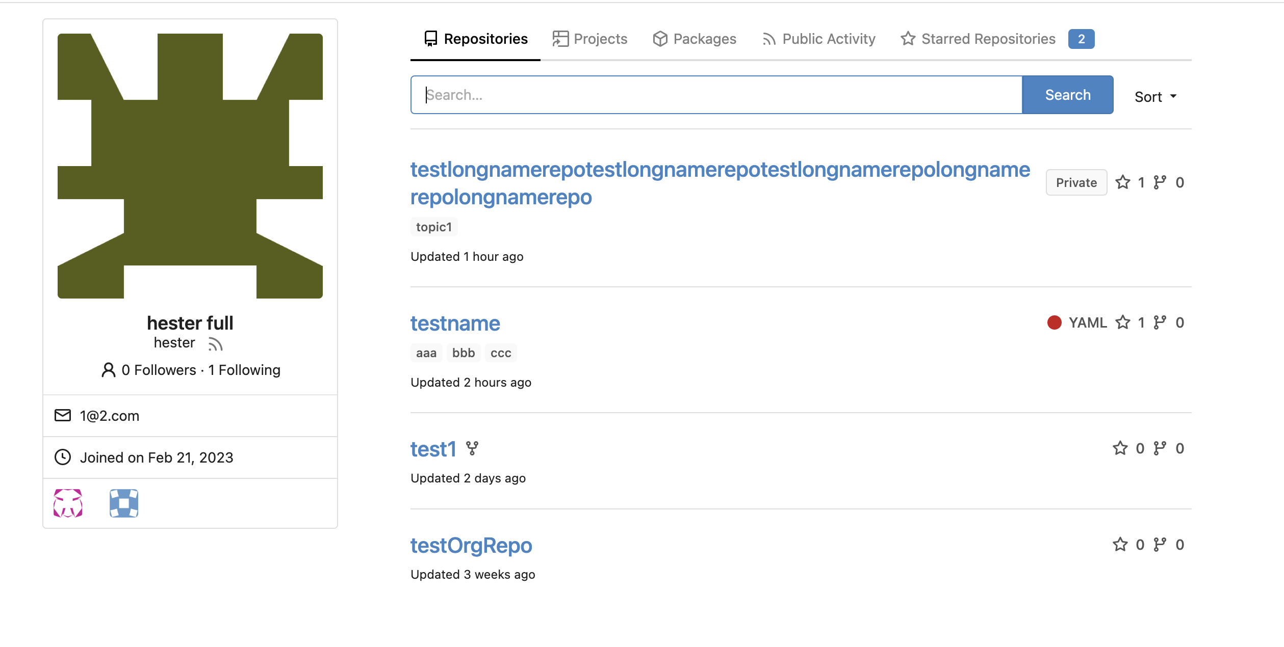
In explore and star pages
<img width="896" alt="截屏2023-03-17 18 25 00"
src="https://user-images.githubusercontent.com/17645053/225878962-9e26e3aa-cff0-451c-9133-19f4ad1507a4.png ">
<img width="913" alt="截屏2023-03-17 18 25 09"
src="https://user-images.githubusercontent.com/17645053/225878967-6adaa414-136e-43c2-87d0-7e46a0da112e.png ">
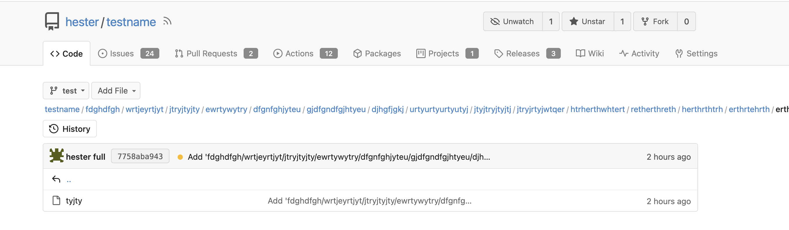
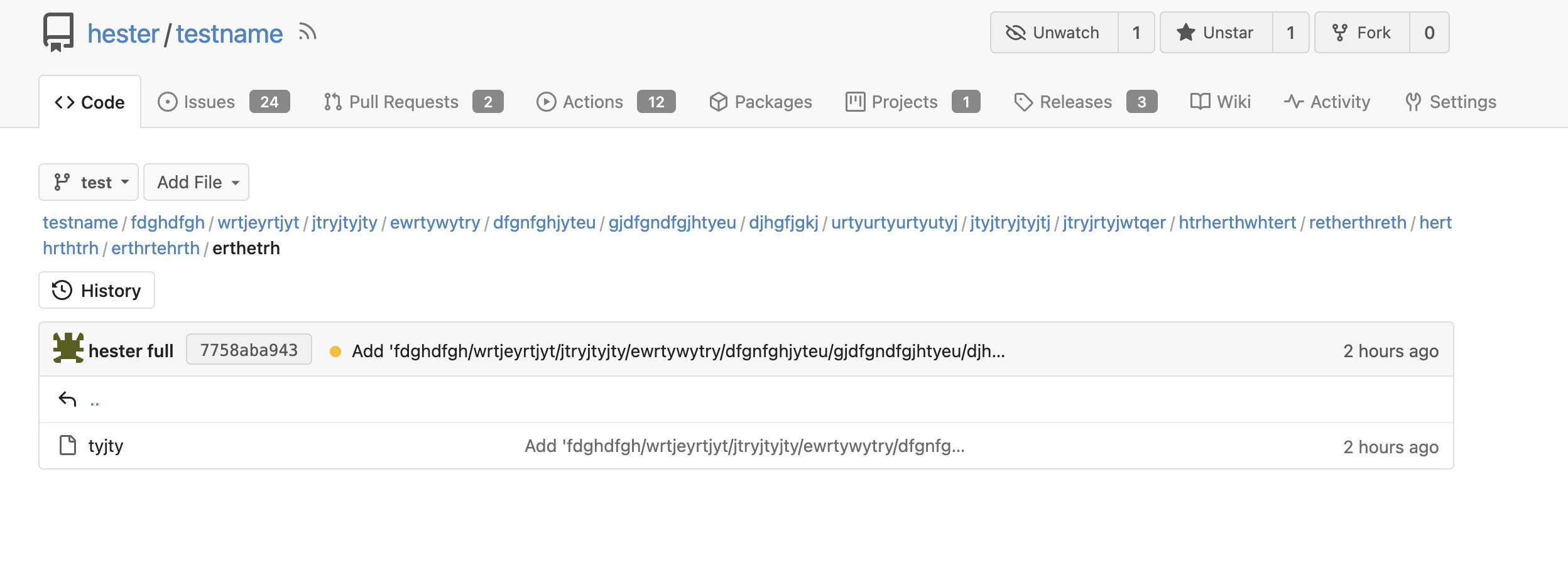
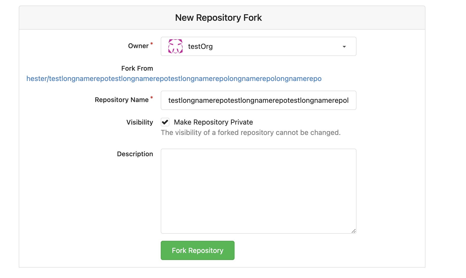
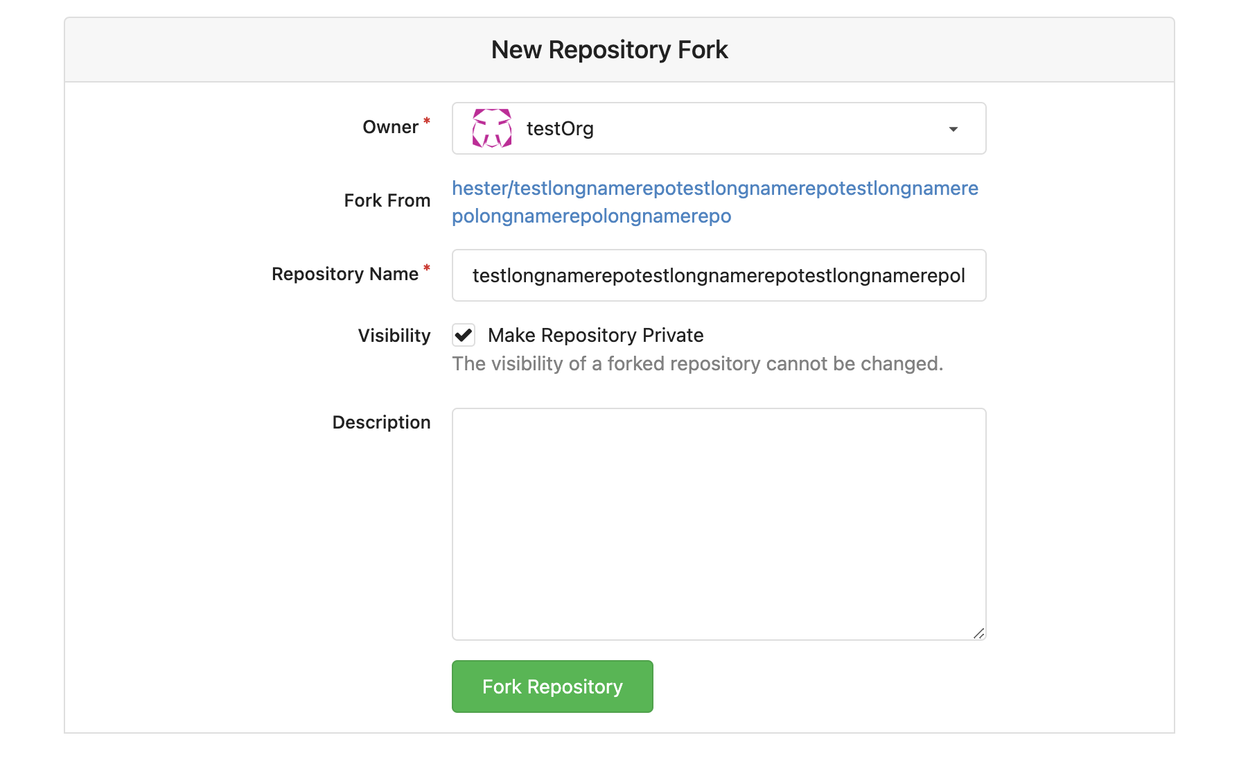
3. Long name repository on creating new fork page
## Before
<img width="919" alt="截屏2023-03-17 17 50 01"
src="https://user-images.githubusercontent.com/17645053/225873723-5c4ea137-3b51-4074-a458-ef442e330ddf.png ">
## After
<img width="907" alt="截屏2023-03-17 17 50 37"
src="https://user-images.githubusercontent.com/17645053/225873772-fc4a52c3-49c6-4ca6-903d-a13707f2a98b.png ">
<img width="383" alt="截屏2023-03-17 17 50 48"
src="https://user-images.githubusercontent.com/17645053/225873779-6de1dfde-5c05-4ae9-89e1-85c25b3a1682.png ">
Closes #23535
Closes #23534
2023-03-18 17:07:59 +01:00
Hester Gong
8120c0c20c
Imrove scroll behavior to hash issuecomment(scroll position, auto expand if file is folded, and on refreshing) ( #23513 )
...
Close #23466

Right now on pull request "files Changed" tab, if a file is viewed, when
the comments' links are visited, the comment will not be shown as the
file is folded after viewed. This PR is to improve the behavior, to make
the comment seen even the related file is folded, like on github.

And right now scroll position will be remembered and hence it won’t
scroll to hashed comment after refreshing, this PR also adjust the
scroll position remembering behavior: When there is hash comment in url,
do not remember the scroll position.

Before:

https://user-images.githubusercontent.com/17645053/225512079-6cf79581-9346-44cf-95d6-06919642e6a8.mov

After:

https://user-images.githubusercontent.com/17645053/225523753-3f6728f2-977b-4ed0-a65c-63dcef2ace80.mov

Update - long comment's behavior after using `scrollTop ` (Comment div
scroll to the position which is 30px below the diff header, or 30px
below top on conversation tab):

https://user-images.githubusercontent.com/17645053/225614460-0602c1a6-229c-41f4-84d2-334e78251486.mov
2023-03-17 18:24:18 +08:00
Hester Gong
8d9f8e10b1
Fix tags sort by creation time (descending) on branch/tag dropdowns ( #23491 )
...
This PR fixes the tags sort issue mentioned in #23432
The tags on dropdown shoud be sorted in descending order of time but are
not. Because when getting tags, it execeutes `git tag sort
--sort=-taggerdate`. Git supports two types of tags: lightweight and
annotated, and `git tag sort --sort=-taggerdate` dosen't work with
lightweight tags, which will not give correct result. This PR add
`GetTagNamesByRepoID ` to get tags from the database so the tags are
sorted.
Also adapt this change to the droplist when comparing branches.
Dropdown places:
<img width="369" alt="截屏2023-03-15 14 25 39"
src="https://user-images.githubusercontent.com/17645053/225224506-65a72e50-4c11-41d7-8187-a7e9c7dab2cb.png ">
<img width="675" alt="截屏2023-03-15 14 25 27"
src="https://user-images.githubusercontent.com/17645053/225224526-65ce8008-340c-43f6-aa65-b6bd9e1a1bf1.png ">
2023-03-16 12:01:10 -05:00
Hester Gong
661e78bed5
Allow both fullname and username search when DEFAULT_SHOW_FULL_NAME is true ( #23463 )
...
This PR adds the ability to search both fullname and username for
assignees, reviewers and author search boxes when the config
[`DEFAULT_SHOW_FULL_NAME`](https://github.com/go-gitea/gitea/blob/6ff5400af91aefb02cbc7dd59f6be23cc2bf7865/custom/conf/app.example.ini#L1238 )
in `app.ini` is set to `true`. Which is originally raised
[here](https://projects.blender.org/infrastructure/blender-projects-platform/issues/14 )
And if `DEFAULT_SHOW_FULL_NAME` is set to `false`(default value), these
search boxes will only show username.
Example:
When `DEFAULT_SHOW_FULL_NAME = true`
<img width="1220" alt="截屏2023-03-14 14 28 06"
src="https://user-images.githubusercontent.com/17645053/224914546-80ef2837-ab72-4d66-9f00-6eb77ed4baaa.png ">
When `DEFAULT_SHOW_FULL_NAME = false` (default value)
<img width="1243" alt="截屏2023-03-14 14 29 37"
src="https://user-images.githubusercontent.com/17645053/224914798-f69ec8a2-0929-4330-827c-3e30188f9b47.png ">
The specific search boxes that adapts these changes include:
1. Author, Assignee search boxes in pull requests tab and issues tab in
repository
<img width="1283" alt="截屏2023-03-14 14 35 01"
src="https://user-images.githubusercontent.com/17645053/224916250-8e452525-71d6-4b48-bf1c-bf7a176abaaa.png ">
2. Assigee and Author on milestones issue page (Added missing search box
for author here)
<img width="1261" alt="截屏2023-03-14 14 38 20"
src="https://user-images.githubusercontent.com/17645053/224916569-d3105619-7824-4bb8-a6d0-1a600eaa9963.png ">
3. Assignee on issues and PR Sidebar, Reviewer on PR Sidebar
<img width="976" alt="截屏2023-03-14 14 41 06"
src="https://user-images.githubusercontent.com/17645053/224917431-c45d821e-9660-4f58-a196-5979a0bb64ce.png ">
<img width="1027" alt="截屏2023-03-14 14 41 58"
src="https://user-images.githubusercontent.com/17645053/224917290-ad4dbc52-0c20-45c4-9fce-9dcd59ad7d47.png ">
4. Assignee when creating new issue
<img width="961" alt="截屏2023-03-14 14 44 33"
src="https://user-images.githubusercontent.com/17645053/224917694-34bee5a7-e975-4f37-8862-56ebc2556808.png ">
5. Whitelisted users for pushing, Whitelisted users for merging and
Whitelisted reviewers in Protected branch settings
<img width="920" alt="截屏2023-03-14 14 48 56"
src="https://user-images.githubusercontent.com/17645053/224918551-9b46b44e-b075-4895-8d33-1aafc7d3c8e5.png ">
<img width="901" alt="截屏2023-03-14 14 49 02"
src="https://user-images.githubusercontent.com/17645053/224918584-efa66f23-a593-4e26-a3eb-bb1fbc5516ae.png ">
<img width="944" alt="截屏2023-03-14 14 49 21"
src="https://user-images.githubusercontent.com/17645053/224918591-be60455d-0513-4f66-84f6-b5e1bc40ff91.png ">
6. "Allowed users" in tags settings
<img width="935" alt="截屏2023-03-14 14 50 11"
src="https://user-images.githubusercontent.com/17645053/224918701-797699aa-c7e5-4290-b3fe-27dcead1c6c7.png ">
2023-03-16 11:32:25 -05:00
f521e88240
Fix actions frontend bugs (pagination, long name alignment) and small simplify ( #23370 )
...
1 Right now on actions page, the action list will not be aligned if
commit message is long. In this PR, the changes are:
- The branch tag is moved to bottom row
- Width percentage is given to make them aligned
- Show "..." if commit is longer than two lines.
- Align the status icon with the commit message with baseline
Before:
<img width="1068" alt="截屏2023-03-08 12 23 22"
src="https://user-images.githubusercontent.com/17645053/223628534-6b9472cb-29f5-40a3-9714-c5152553049e.png ">
After:
<img width="756" alt="截屏2023-03-08 13 34 28"
src="https://user-images.githubusercontent.com/17645053/223628571-da94698b-0e0a-43e3-ae82-34d8c780e5ba.png ">
2 Right now the actions list's pagination is not working properly
because Param is not passed to pagination template, in this PR Param
Strings are passed to the pager
Before:
<img width="1176" alt="截屏2023-03-08 12 23 50"
src="https://user-images.githubusercontent.com/17645053/223629207-8b67ce74-2342-4259-bc81-036e37752716.png ">
After:
<img width="1343" alt="截屏2023-03-08 13 11 54"
src="https://user-images.githubusercontent.com/17645053/223629321-4f538f8a-45dc-4d6f-ae60-2c82680ae3e7.png ">
3 A small simplify in `RepoActionView.vue` .
---------
Co-authored-by: wxiaoguang <wxiaoguang@gmail.com >
Co-authored-by: Lunny Xiao <xiaolunwen@gmail.com >
2023-03-13 13:31:06 +08:00
Hester Gong and Lunny Xiao
a2f44463f0
Fix adding of empty class name ( #23352 )
...
This PR is to fix the error shown below. The reason is because
[`class-name`
prop](https://github.com/go-gitea/gitea/blob/main/web_src/js/components/ActionRunStatus.vue#L6 )
given to `svg` component has a space, and classList cannot add empty
string.
https://user-images.githubusercontent.com/17645053/223346720-c7f9de43-5e69-4ecf-93c0-90bf04090693.mov
---------
Co-authored-by: Lunny Xiao <xiaolunwen@gmail.com >
2023-03-07 23:08:22 +08:00
Hester Gong
471b6d24b4
Fix PR view misalignment caused by long name file ( #23321 )
...
Close #23248

The UI after this PR:


https://user-images.githubusercontent.com/17645053/223009758-7f0c9f12-d346-4cb2-a605-729fddce732f.mov
2023-03-06 09:44:04 -06:00
Hester Gong and Lunny Xiao
ea7f0d6fcf
Change interactiveBorder to fix popup preview ( #23169 )
...
Close #23073 .
Used the solution as reference to the reply:
https://github.com/go-gitea/gitea/issues/23073#issuecomment-1440124609
Here made the change inside the `contextpopup.js` because this is where
the popup component is created and tippy configuration is given.
Co-authored-by: Lunny Xiao <xiaolunwen@gmail.com >
2023-03-05 23:40:50 +08:00
Hester Gong and delvh
7f9d58fab8
Support paste treepath when creating a new file or updating the file name ( #23209 )
...
Close #23204
Quick Demo:
https://user-images.githubusercontent.com/17645053/222058727-ad30a37c-f0ac-4184-9946-a71fcee473b5.mov
---------
Co-authored-by: delvh <leon@kske.dev >
2023-03-03 17:28:20 -05:00
HesterG
ffce336f18
Use async await to fix empty quote reply at first time ( #23168 )
...
The reason why quote reply is empty is when quote reply is clicked, it
triggers the click function on `.comment-form-reply` button, and when
the first time this function is triggered, easyMDE for the reply has not
yet initialized, so that click handler of `.quote-reply` button in
`repo-legacy.js` got an `undefined` as easyMDE, and the following lines
which put quoted reply into the easyMDE is not executed.
The workaround in this PR is to pass the replied content to
'.comment-form-reply' button if easyMDE is not yet initialized (quote
reply first clicked) and put the replied content into it the after
easyMDE is created.
Now quote reply on first click:
https://user-images.githubusercontent.com/17645053/221452823-fc699d50-1649-4af1-952e-f04fc8d2978e.mov
<br />
Update:
The above change is not appropriate as stated in the
[comment](https://github.com/go-gitea/gitea/pull/23168#issuecomment-1445562284 )
Use await instead
Close #22075 .
Close #23247 .
2023-03-02 13:53:22 -06:00
HesterG
d20b29d7ce
Fix height for sticky head on large screen on PR page ( #23111 )
...
Right now on the PR 'File Change' Tab, the file title header sticky to
the top on large screens has wrong height, resulting in wrong ui
behavior when scrolling down. This PR is to fix this.
Before:
<img width="964" alt="截屏2023-02-24 17 12 29"
src="https://user-images.githubusercontent.com/17645053/221140409-025c4a84-6bbe-4b5b-a13f-bd2b79063522.png ">
After:
<img width="1430" alt="截屏2023-02-24 21 10 12"
src="https://user-images.githubusercontent.com/17645053/221186750-0344d652-4610-4a90-a4c0-7f6269f950d6.png ">
2023-02-24 14:29:49 +00:00
HesterG
045becf9aa
Add HesterG to maintainers ( #23104 )
...
[List of mine merged
PR](https://github.com/go-gitea/gitea/pulls?q=is%3Apr+author%3AHesterG+is%3Amerged+ )
2023-02-24 14:31:02 +08:00
HesterG
8ed6096158
Add wrapper to author to avoid long name ui problem ( #23030 )
...
This PR is a possible solution for issue #22866 . Main change is to add a
`author-wrapper` class around author name, like the wrapper added to
message. The `max-width` is set to 200px on PC, and 100px on mobile
device for now.
2023-02-23 14:28:18 -06:00
HesterG
3adfc0f02d
Change style to improve whitespaces trimming inside inline markdown code ( #23093 )
...
Given mardown source
```
x ` a` y
x `a ` y
x ` a ` y
```
Render
<img width="1421" alt="2023-02-23 15 33 14"
src="https://user-images.githubusercontent.com/17645053/220844280-a304c788-ac79-4a26-a55a-0db00f2fb3f3.png ">
Fixes #23080 .
2023-02-23 20:57:03 +08:00
HesterG
a78e0b7dad
Add accessibility to the menu on the navbar ( #23059 )
...
This PR is trying to add accessibility to the menu as mentioned in
#23053 so the menu can be accessed using keyboard (A quick demo is added
below), with a reference to
[PR2612](https://github.com/go-gitea/gitea/pull/22612 ). The goal is to
make the menu accessible merely using keyboard like shown below. And
this PR might need confirmation from developers using screen readers.
2023-02-22 15:58:07 -06:00
HesterG and delvh
9ebf6424ee
Remove dashes between organization member avatars on hover ( #23034 )
...
On the home page of an organization, there are unexpected dashes between
the avatars of the members when hovering over the avatars, as shown in
below:


This is because in `fomantic/build/semantic.css` there is a
rule `text-decoration: underline;` when hovering over the `<a>` tag.
Here, the `<a>` tag has width and height because of the avatar image inside,
leading to the unexpected underlines.
This PR overrides the `a:hover` rule so the underline does not exist anymore.
Co-authored-by: delvh <leon@kske.dev >
2023-02-21 12:28:31 +01:00
e3cffa70f9
add margin top to the top of branches ( #23002 )
...
add margin top as mentioned in #22973
---------
Co-authored-by: jidi <jidi@jidideMacBook-Pro.local >
Co-authored-by: Lunny Xiao <xiaolunwen@gmail.com >
2023-02-21 13:03:44 +08:00

 Hester Gongandwxiaoguang